Many of you have questions on what are the techniques to use when digital painting skin and how to make it look believable and alive. Many times when we look at beginners’ paintings, the skin tends to look a little bit dull or lifeless. So that’s basically what we want to tackle. We’ll run you through how we created the illustration and hopefully you will have somewhat of an understanding on what to do to create believable and good looking skin.
How to use color
 The first thing that we want to explain you is how to use color. Some very basic principles that you need to follow in order to make your colors pop. Know or study the color wheel. This is really easy to understand but it’s really important as well basically on the top right you see the warm spectrum and on the lower left you see the cold spectrum. You have six primary colors, yellow, orange and red green, blue and violet. Basically, red and blue are your primaries and orange yellow violet and green are your secondaries, but let’s just call them primaries because they’re like the most important. And so yellow orange and red are warm colors, green blue and violet are cold colors. They are important because when you’re painting and your light source is warm, you want your shadows to be cold and vice versa. So, if your light source is cold, you want your shadows to be warm and this doesn’t apply to every situation but most of the time this is what you want to follow.
If the face is in the light and there is only one light, so face has some yellow, some red, some oranges. The face is mostly in warm light and the shadows down are bluish violet, so this is cold and the face, it’s warm. You may want to keep that in mind when you’re painting. If your light source is warm you want your shadows to be cold, and if your light source is cold, you want your shadows to be warm. That really makes an image pop. It’s a really easy principle to understand and to apply, but you need to know it. Many beginners say they really don’t know about these things even though they’re really simple to apply to your paintings, they make such a huge difference. You don’t have to fully understand the whole color spectrum and how it works but slowly kind of ease into it. Try to understand the basic rules that apply to colors. Just remember, if your light source is warm you want your shadows to be cold.
Set the base skin color first
Next, we’ll just run you through how we created this illustration and the steps we’ve taken and what went through my mind and why we’ve done certain things that we’ve done. What you see here is the original sketch. It’s not too detailed, it’s pretty loose, but it has enough information for me. To get started at painting, and also, a quick tip is to maybe have your sketch in a slightly reddish tone, it helps later on when you’re painting, to make it look a little bit more natural, a little bit more human. We created a base layer and this is just a flat color and most of the time, it’s also the skin color. We set the skin color first before we start painting anything else. With the skin color palette, what you want to pay attention to is that it’s not to saturate it and not to desaturate it. And not too light and not too dark, so you want a kind of a mid-value. Something that is comfortable to look at. If you look at the color wheel, it’s a pretty natural at the end and nice color. It’s not something that’s too bright, not something that’s too saturated, and not too dark. It’s kind of like a really comfortable mid value.
Give all of the other things a flat color

The first layer of shading that you apply, don’t go overboard and be really cautious and paid a lot of attention. Try to hit the main points of shading and this is really important. You don’t want to go in there too fast and and do like final touches. You need to see what works and whats not, and also, when you’re painting females, you don’t want to put in too much shade because it starts to make them look a little bit old. You need to have a nice balance between soft and hard shadows and edges. Just keep it simple and one step at a time.
Simple layer of lighting
Do the same thing for all of the other layers and add a simple layer of lighting. Know where your lighting came from. For example, if you knew that the lighting was coming from the top right, so just add simple layer of lighting and then just kept going. Add some basic shading to her hair, again really basic but you can see that the more layers of shading that you’ve added, the more it comes to life. The second layer it looks already much better than before and then the third layer of shading to her hair it makes a huge difference. Don’t rush it at all. Take it one step at a time really slowly. Start deleting parts of sketch and until what’s left is the main image. Keep working on it on another layer of detail and the delay of shading, you can see shade in her nose ring and some more lighting to her hair and eyebrows.
Add depth to make it not to look flat
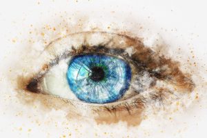
You don’t want your painting to look flat and so in order to, add depth. Add contrast to your painting by adding darker colors and brighter colors to it. Whenever there’s contrast, it adds sharpness and also depth. While adding darker colors, you can see that it starts to pop instantly. It makes such a huge difference and also you can see, there’s a really bright orange it’s because there’s the translucent skin and the ambient light is shining through. Those effects will make your skin color painting look believable. The shadow is basically an area where light doesn’t get to and this time, just add a few more shadow. The more you pay attention to these things the more believable your paintings will look. The more you know about these things, the better impression you will leave to the viewer and and sometimes the viewer doesn’t know what makes an image good. They just don’t know but they they have a sense for a good image, they just can’t tell what’s good about it. So it’s view the artist, who needs to create that perfect illusion and kind of fake reality with which you’re painting.
Digital Painting

If you’re working on a client commission then definitely want to give it all you want to do like a hundred percent maybe even more but when you’re working on personal pieces and you just trying to get better, then don’t focus on perfection, focus on quantity. Do as much as you can and that’s one of the best ways to get better in a shorter amount of time.
